Any photographer who has seriously contemplated their work knows that a photograph isn’t finished when you release the shutter and take the exposure. That’s just half the job. The other half is editing or post-processing to create a polished look that makes the photo stand out.
Foolish Bricks is one such photographer who knows how to create impact with his minifig photography. I have been following him on Twitter for almost as long as I have been photographing these four-brick-tall toys and have watched his storytelling, camera and editing skills evolve. For me, this is the type of toy photographer I love to follow — one who is levelling up — because it’s great to witness growth.
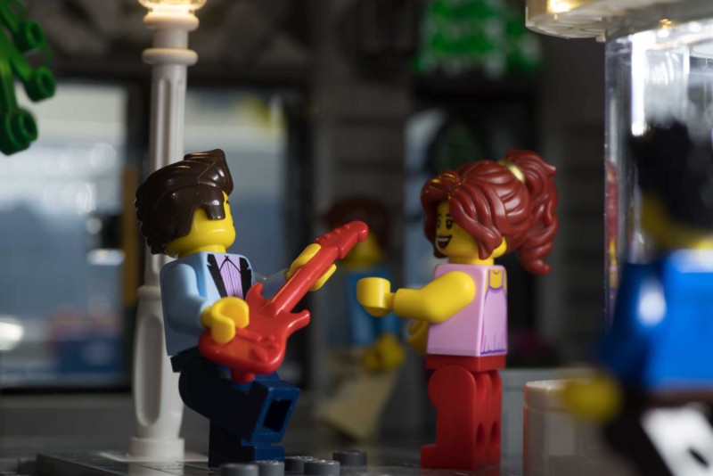
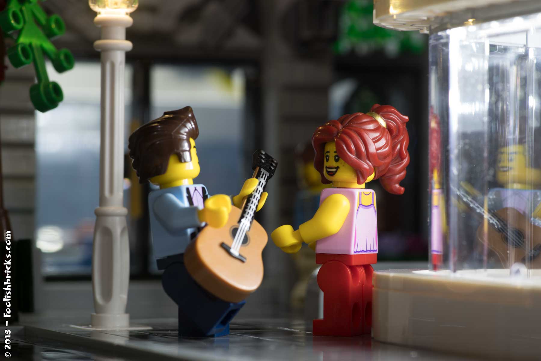
In this post, Foolish Bricks lets us in on how he conceptualized, set up, shot and edited this photo of a singer serenading a woman outside on the street.
Setting up the scene
Foolish Bricks typically begins with a very crude idea for his LEGO photography and ponders how much time he has to build a scene that would satisfy his creative goal. For this photo, he knew he wanted to use contrasting lights: cool and warm. He didn’t have enough time to create a MOC though but noticed Downtown Diner had a large window facade he could light and also had a lamppost from Brickstuff he had lying around.
For the minifigs, Foolish Bricks placed the singer from the diner set on the sidewalk by the lamppost but also wanted someone to react to his singing, so he created a lovely lady for the scene. “In the end, I had a warm lighting on the left of my scene, with a cool guy in the middle left, in contrast with a cool right side of the image, with a ‘warm’ lady in the middle right. Maximum contrasts all around. I gave the lady red hair to accentuate the contrast with the cool diner-window even more.”
To light the minifigs, Foolish Bricks used a daylight temperature LED light from Falcon Eyes and placed it inside the diner.
Foolish Bricks created depth to this scene by placing the ground floor of the Brick Bank in the background and added a second LED light inside to prevent it from being too dark.

“Besides having depth, I also wanted a sense of a busy off-screen world. This combination is the reason that I often have minifigures partly and out-of-focus in a scene. They should appear to be logically placed, but should not interfere or distract from the central image. At first I had a minifigure in the foreground, but that one distracted too much so I placed him in the background. Also, the electric guitar did not fit the scene, so I replaced it with a guitar from a Mexican minifigure.”

Shooting the scene
This scene was shot with a Pentax K1 with a 100mm macro lens at f/11, ½ s, and ISO 100 in Foolish Bricks’s basement. “Whenever possible, I shoot all my images from a tripod. When there are no moving elements in the scene this allows me to choose very long exposure times. This in turn allows me to be more creative with my aperture settings, besides keeping the noise to a minimum because I can shoot at the lowest possible ISO. Lastly, shooting from a tripod diminishes most of the camera movement. To further reduce possible camera-movements I also use a remote control.”
Editing the photo
Some of the editing done such as removing dust specks and lowering the exposure of the much-too-bright LED lights were corrective but the rest of Foolish Bricks’s adjustments were according to taste.
“Afterwards, I increased the contrasts, deepened the colors and partially accentuated the color-temperatures, mostly to increase the contrast between the warm (the right of the image) and cool lighting (left of the image). As a final touch, I added a few light beams, simply because I like the look of them.”
Slide the bar between the two photos below to see a before and after:


Overall, the photo shoot took about 1 hour: 15 minutes to set up, 45 minutes to shoot and 10 minutes to edit.
The Foolish Bricks Challenge
Conceptualizing a wonderful scene and using camera settings appropriate for it makes for a good photograph, but knowing how to edit your photos to bring out the best version of your artistic vision is what can make it great.
Post-processing is a crucial part of any creative’s workflow, whether it’s photography, audio or film. This short video highlights how artistic editing impacts look and feel:
So this challenge will be all about using Snapseed, Lightroom, Photoshop, GIMP, Instagram or what have you to create a polished look for your photos. Post your edited photos to Instagram with #inthestyleof_foolishbricks and don’t forget to mention @foolishbricks or @fourbrickstall to get our attention. Bonus points if you post a before and after photo!
If you’ve never edited a photo beyond using an Instagram filter, I would highly recommend you download Snapseed (Android and iOS) and learn how to make basic adjustments. Here’s a good overview of how to use Snapseed:
https://youtu.be/UsiugQE8B7w
My basic workflow in Lightroom, Photoshop or Snapseed almost always includes sharpening, increasing exposure on faces with a brush, creating more contrast with curves, and toning down highlights on the minifigs so those might be a good place to start.
This challenge ends September 9.
More from Foolish Bricks:
