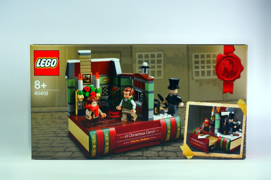
LEGO often has a Christmas themed GWP (Gift With Purchase) set available to customers buying from them in the run up to the festive period and this year is no exception. Set 40410 Charles Dickens Tribute is one of this year’s offerings and Brickcentral were kind enough to send me one to review in advance of its release.
What Is In The Box
The set has 325 parts (including 3 minifigures) that build both the book and a scene from Charles Dickens’ A Christmas Carol. It is primarily a display piece though I am sure it does have some play value too.
The set has a fair few stickers that are quite prominent, specifically those that adorn the spine of the book. I do not usually mind stickers too much and you certainly cant complain too much on a set that you can get for free.
However, the most prominent stickers are my least favourite type – long and thin. I really struggle to apply these accurately and it took me a few goes of carefully applying them with a brick separator (if you didn’t already know, that’s a super handy tip for helping to place stickers!) before I was happy with their placement. I think the stickers are important though and add detail that is needed.
The figures with the set are of course based on characters from the book.
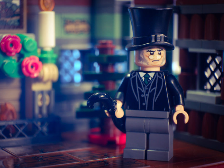
Ebeneezer Scrooge has a unique head print that’s so far only in this set, and I think it’s a good one that both fits the character and could be useful for custom figures. It’s always good to have some different sorts of faces, and grumpy old men are not that common. His torso is also fairly rare having only appeared in a single Harry Potter set.
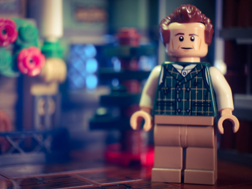
Scrooge’s suffering employee Bob Cratchett is the other full height minifigure. I believe his green sweatered torso is new for this set. Again, a nice looking figure with parts that could be used for other characters and story telling.
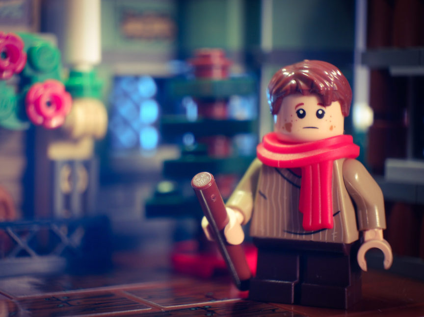
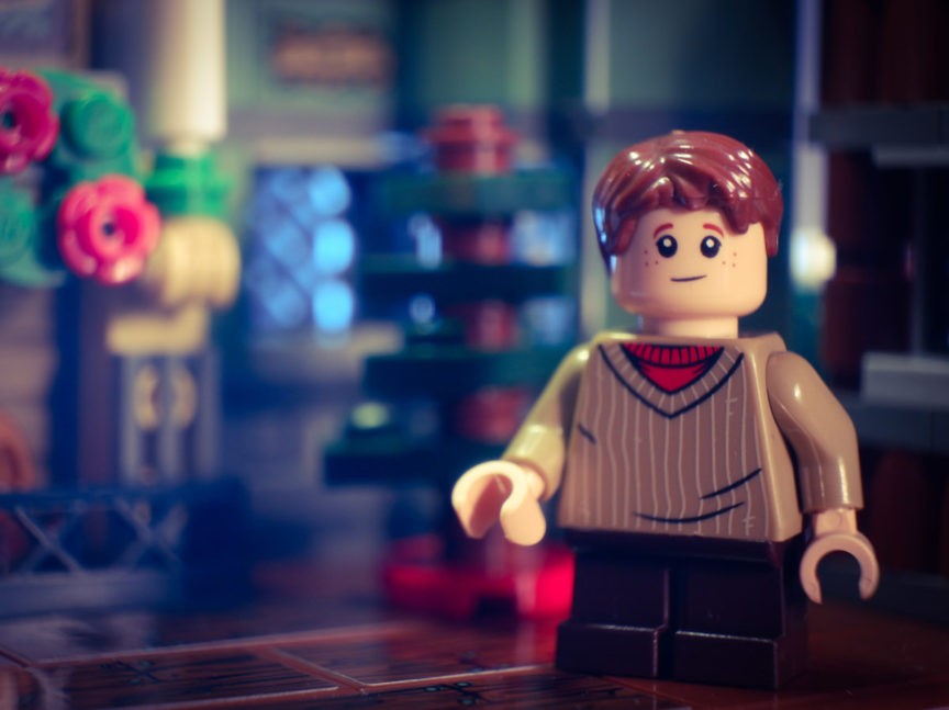
Rounding out the figures of course is Tiny Tim. He is the only figure to feature dual sided facial expressions. I believe that head piece is the final new part in this set. It’s another good one that suits the character well. The red scarf is also nice to get since it’s not that common yet.
The Set
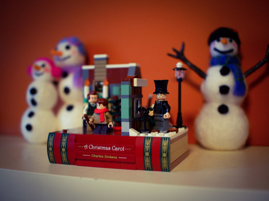
The set makes a nice display piece in my opinion. The combination of the book and small vignette looks great. There is no clever pop up feature that allows the scene to fold away but that would have made this more complex and probably less aesthetically pleasing on a shelf with other Christmas decorations.
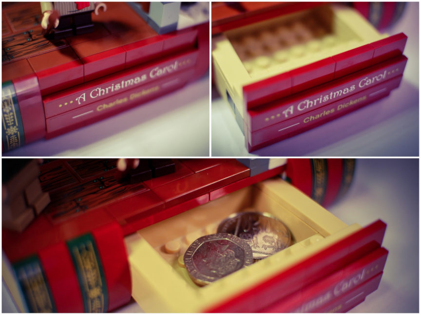
The use of the modified 1×2 tan bricks for the page effect looks great and it definitely looks like what it’s supposed to. It also has a fun little secret compartment; it’s not very big but it may be a fun place for Santa Claus to hide a small present when he visits.
Using the set for Photography
While I like this set as a display piece I also need to look at it from a toy photography perspective since that’s my main focus with LEGO.
The first thing anyone looking to use this set in a scene for photos will notice is that the vignette is very small. This limited what I could do with it and what angles I could shoot from but I still wanted to capture a few different scenes and stories.
Firstly I wanted to get some images of Bob and Tim enjoying their cozy home together.
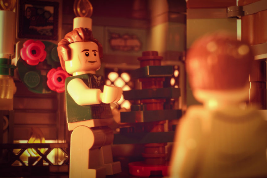
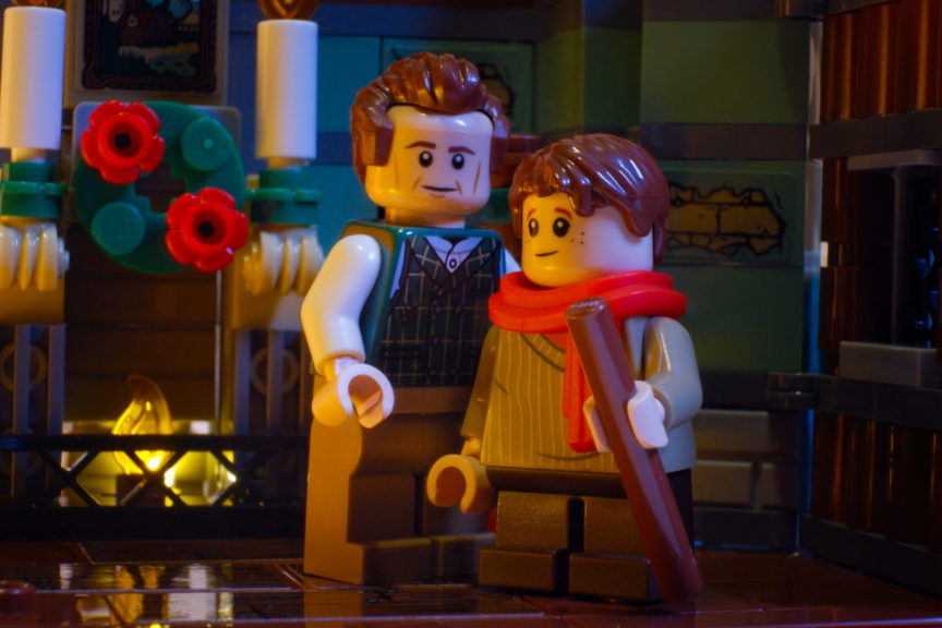
To try and infuse a bit more warmth in the shot I wanted there to be some light coming from the fireplace. I removed a single brick and popped a small led light behind the flame.
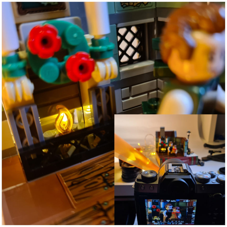
They were fairly straightforward shots, bringing Scrooge in and trying to engage him with Bob or Tim was more tricky. The angle used in most of the interior shots above shows almost the entire Lego background.
Other angles were tricky due to the cross section nature of the build coupled with the fact its partly a book, perhaps with a macro lens I could have done a little more.
Regardless, I first wanted to show Scrooge in the cold to contrast with his less affluent counterparts in the warmth.My first attempt still looked a little warm as I tried to balance the outdoors with the warmth coming from the house. I also tried to take a shot from higher up to get a different view of the scene without having to fill the background.
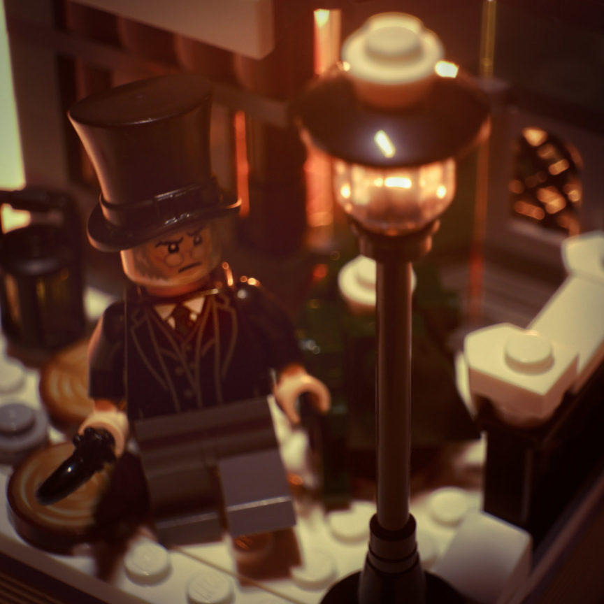
I found it easier to balance the warm and cold with an eye level shot. This required a closer crop, again due to the small background the set provides.
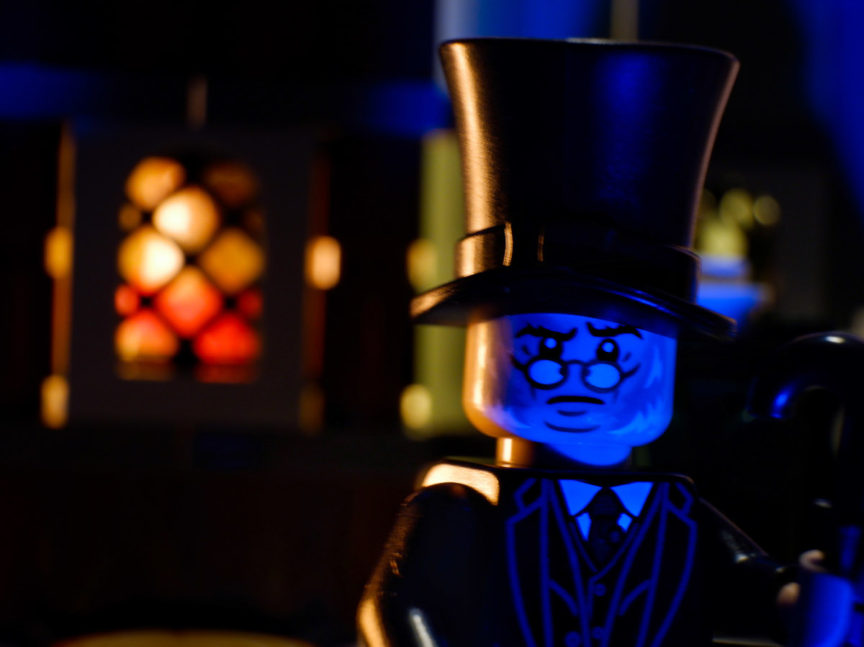
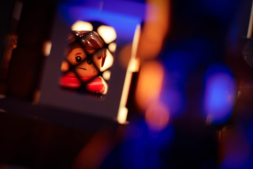
To get the angles right on these shots I used the fact that this is LEGO to my advantage. I removed Scrooge’s legs. That way it didn’t matter that the side of the house with that window is so low.
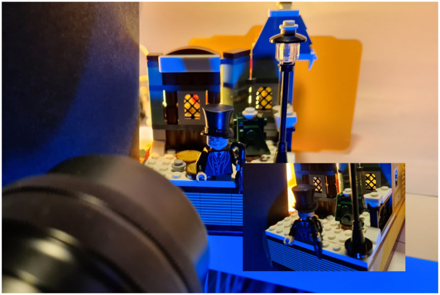
The outside space is really nice, particularly the side of the roof. But I couldn’t find a way to include that in an interesting shot. I focused on the area directly outside the door since that offered most opportunity, still limited by the small space but with floor space and a full wall for the background.
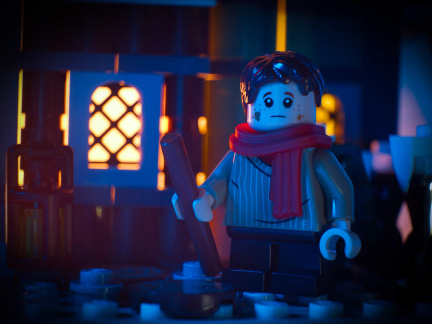
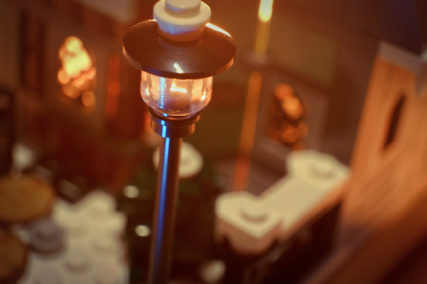
My favourite incarnation of A Christmas Carol is the Muppet’s version and to be honest that’s the only version I have seen in over a decade. I watch it every year with my family on Christmas Eve. There is a moment in that where Scrooge is given a red scarf by Beaker and since this set has a red scarf I wanted to recreate that moment.
Does something like this happen in the original Christmas Carol? Please let me know in the comments because I can’t remember and I couldn’t find a reference to it online anywhere!
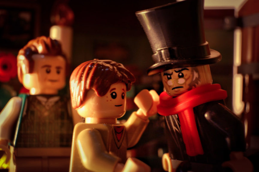
Finally I thought I would have a little fun with figures from other sets using the vignette
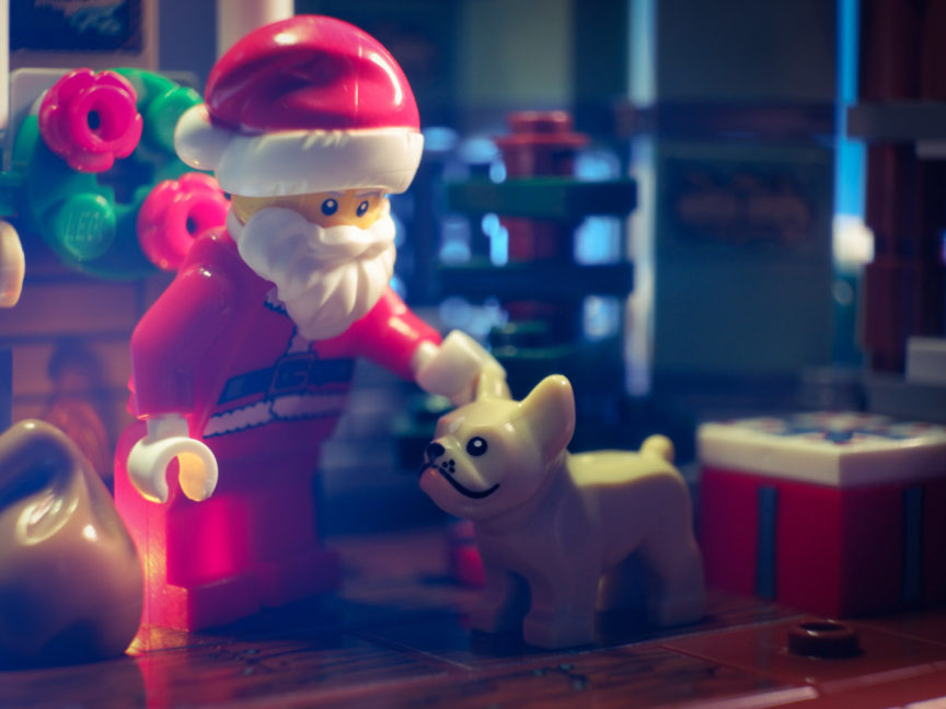
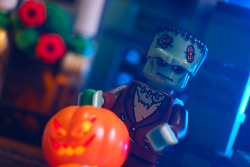
Santa takes a little break above to say hello and a familiar face seems to have gotten his holidays mixed up.
Final Thoughts
The Charles Dickens Tribute is a lovely little display piece for LEGO fans who like A Christmas Carol. The build is simple but very effective and I love the way the book looks, I could see this being the beginning of a sub theme.
Some of the stickers are a little annoying to apply but do add important detail. The set is only available as a free gift so it’s hard to be too critical of something like this. From a photography perspective one good thing is that despite being small the spaces are open, so lighting this was easier than some LEGO sets I have tried to shoot.
The set is limited for story telling opportunities in my opinion with its small spaces, though I did manage to get a few out of it and perhaps others with more imagination or different kit could do more. I certainly feel like I missed a trick with the outdoor space and I will be looking to see if anyone else does anything interesting with that. I think if you had just a few additional parts in these colour schemes you could easily expand the interior and exterior a little and get something much more versatile if you are a fan of custom building.
