I love shooting in the dark. It’s probably my favorite time to take photos since I am undisturbed by kids, dogs, phones and life in general. Ok, it’s my favorite time for everything since I am quite the introvert and really prefer focusing my energy on just one thing.
Konstantin’s challenge was all about light painting, and for this technique, darkness is best. For this scene, I wanted to use light to create shapes in the air rather than paint in a background. I thought about a few stories that I wanted to tell using light painted shapes, wrote them all down and decided on the one about the wizard conjuring a spell with a magical staff.
The minifig
LEGO has a few “good wizard” minifigs like the one from Series 12, and Merlok (an exclusive minifig included with LEGO NEXO KNIGHTS: The Book of Knights) but the one I like best is from the Castle theme. I like that he has legs rather than that dress slope piece. Also, I think he has the best hat of the three.
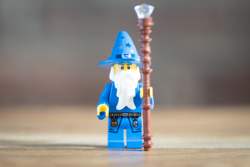
To make him even more wizard-like, I added some sleeves from BrickWarriors. The sleeves are genius! Installation is as simple as pulling out the hands from the arms, sliding the hand shaft into the hole of the sleeve piece, and then re-inserting the shaft into the arm. The downside is that BrickWarriors only makes them in blue and red. I would love to have these in black, white, and brown at least.
The quarterstaff is also from BrickWarriors but I added the hole with a stud and stuck a jewel on top of the whole thing to make it magical. I mean, what is any decent wizard going to do with a melee weapon? Nothing, so better enchant that thing, right?
The setup
I have to admit that I was overeager to do some light painting so I didn’t bust out the micro garden or build any props. I simply put the wizard on the dining table, launched Pocket Softbox (Android only) on my phone, and propped it up on the napkin holder that was already there to add some light to the front of the minifig.
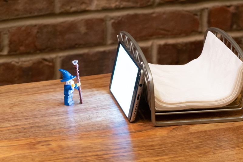
I knew that the Brickstuff LED I’d be using for the light painting would illuminate the minifig quite a bit but that there would shadows under the brim so I made sure to position my phone to get some light on the minifig’s face. Within the app, I set the screen brightness to its lowest setting since I’d be using a long exposure (between 4-8 seconds) and would let the shutter speed build up the light.
I set my Sony a6500 on a Platypod – basically, a flat tripod – and got to work.
The shoot
Light painting requires a lot of trial and error since you can only see the results on your screen when the shutter closes and the camera finishes processing. I set my ISO at 100 and aperture at f2.8 so the only camera setting I needed to fiddle with was shutter speed. I still had to mess around with the intensity of the LED and the distance of the phone screen during the shoot to make sure everything was how I envisioned it in the end result.
I put my camera on a 10-second timer so I could get the LED into position over the minifig’s staff before the exposure began. I held the LED by its wire, about two inches (5 cm) from the LED itself, to make sure that my fingers would be out of frame and so that I could rotate it comfortably. I also added a black stud with hole over the LED so that that the light trail would change shape a bit as I swirled it around the quarterstaff.
Before the 10-second timer was up, I would already start swirling the light to make for a more fluid trail.
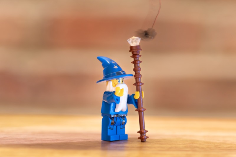
The particular LED I used was a “cool white”, which emits a color that is more blue. I always shoot in RAW and process my photos myself so this wasn’t really an issue for me, but you could experiment with white balance settings in camera as well as change the color temperature of your secondary light source to affect the overall color in the photo if you wanted to do this in camera. When doing portrait work with real live people, I use gels on my flashes to get skin tones right but with toy photography, I’m not as deliberate.
Post processing
The first thing that I wanted to address in the photos was the color cast. I did like the blue, but not that much blue. I played with color temperatures in Lightroom until I reached a color that I liked: not exactly white balanced as is shown below, but much warmer than what it was originally.
Also, I reduced the saturation a little bit as I always do in when I shoot in the dark.
Because I didn’t build anything or use any other elements in the scene, I ended up with too much negative space in my photo. I could have framed or cropped it differently but instead, I used the opportunity to create a little bit of interest in the background in post. I quickly searched for a tutorial on how to create stars in Photoshop and found this:
After brushing in the stars, I used a gradient to change the black sky to a more purple sky and created a couple of radials to highlight some parts of it for texture. It kind of looks like a galaxy!
Lastly, I darkened the foreground a bit using another gradient.
All this post-processing took about 15-20 minutes.
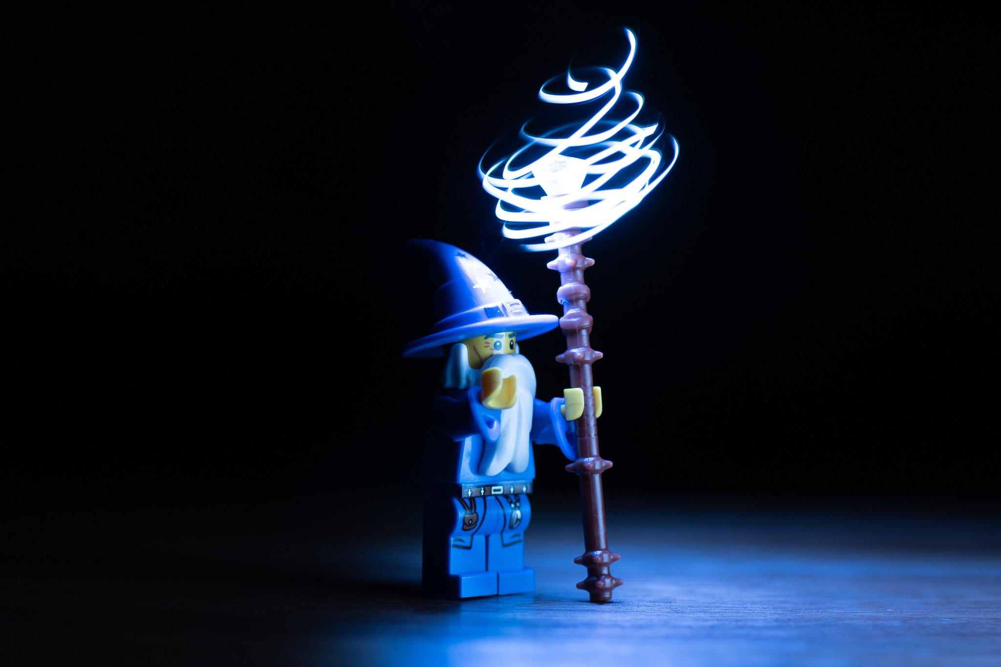
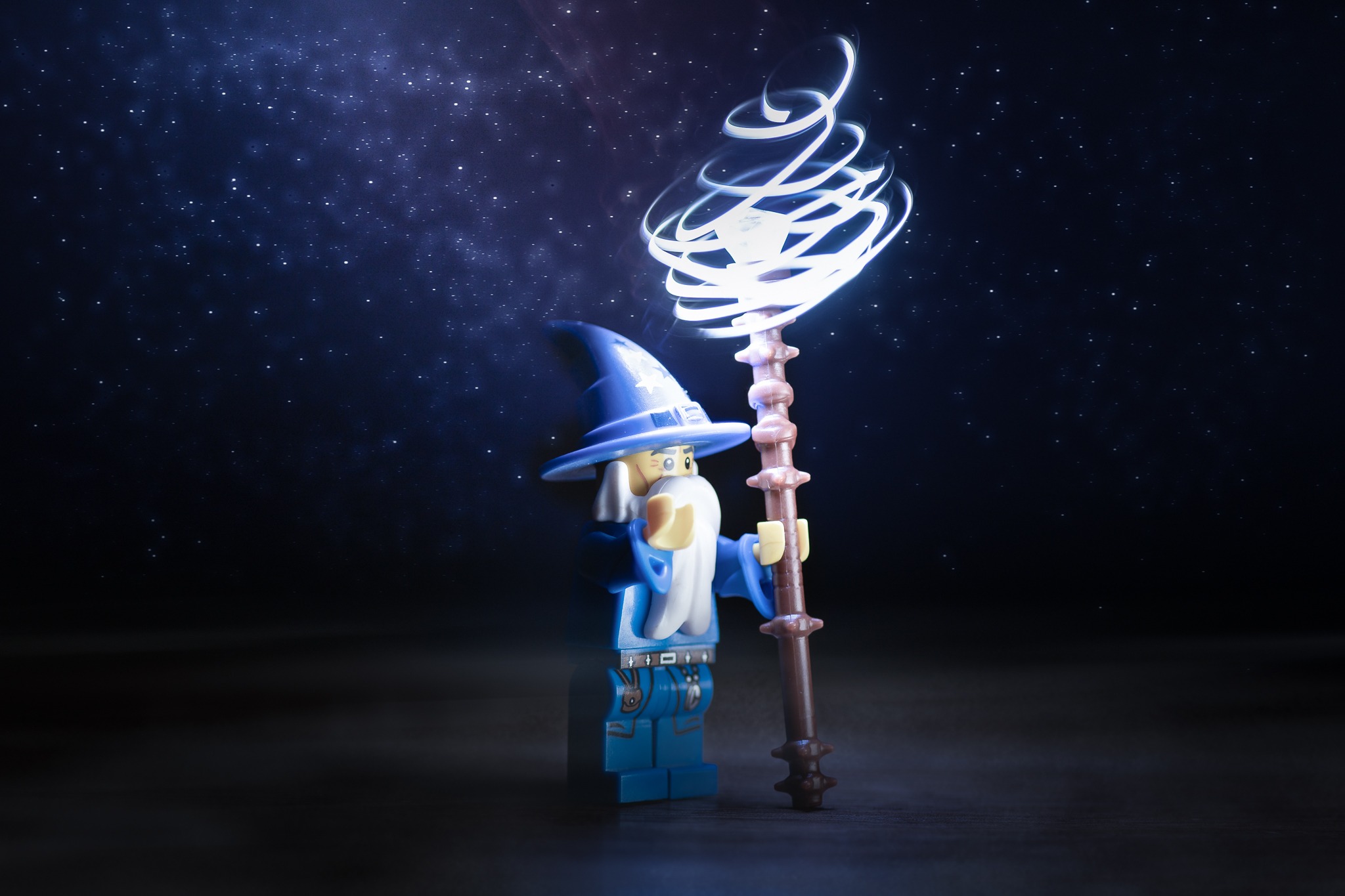
Overall, I really like the effect of the light painting I created in camera and the galaxy background I made in Photoshop. Next time, I will not heed the marshmallow-gobbling child in me and take more time to set up an environment. But for now, I will consider this light painting challenge complete.


