Through the years, BrickCentral has been very helpful with various tips, revealing little secrets of photography. I will show you some tips that can help you make your pictures look like you can freeze time.
Composition and storytelling
I’m sure you’ve heard about the rule of thirds. The idea is to put your object away from the center of the picture and put it in one of the sides of the frame, taking one-third of it. This way, your picture will look and feel better to the person who is looking at it. You show both the main subject and the environment around it.
One thing you should watch out for is straightening the horizon and vertical lines. When your picture is straight, it feels more satisfying to the viewer. So when you shoot, it will be easier for you if you use the grid on your camera or phone. Of course, there are exceptions. If you want your subject to stand out, you can put him in the middle, but you should fill up the frame.


Guiding lines and posing your subject. These are the lines that lead you to the main subject. In my case, these are the pumpkins and the path with rocks between the farmer and the giant pumpkin. Here, we can see the farmer leaning backwards, away from the pumpkin, meaning he’s afraid of the thing he is seeing. And we know he’s scared without seeing his face.


In the second picture, the walls around Mateo and the staircase are our guide lines. The walls are in focus, and so is Mateo, as he’s confidently standing in the foreground. The lines of the stairs lead our eyes to the background where there’s someone walking towards our main character.
Another thing I want to add here is storytelling. In order to make an impression on the viewer, it’s good for your subject to be interesting and to grab his attention. Posing the subject according to the scene makes a general impact on the viewer.
Also, use light cleverly. You can use different colors of light to improve your storytelling. Previously, we had tips about light colors and what they mean; you can check them out here in the blog.
Light
The key is to make the light look natural. The best way to make it look natural is to show where the light is coming from. When we see the light source, our brain can perceive the information easier, and it’ll be logical from where the light is coming from. The sun is coming from the window, the lamp is shining, the TV or monitor is on, so it’s the source of light, and so on. When you think about it, we always see this in the movies.
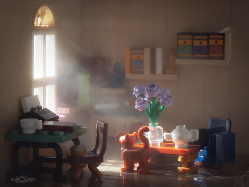
In this example, the only source of light is the sun coming from the window. I used a cardboard to cover the wall against the sun so that it doesn’t shine through the bricks. The sun rays are naturally created with the help of a face mister. I made this picture thanks to @fourbrickstall and her cardboard challenge some time ago.


You can use sunlight or other lights, like LED ones. The picture with the pirate is lit up with LED lights, recreating the warm sunny rays entering this pirate’s cabin.
If you play with objects to create shadows, you can accomplish interesting effects. For example, I put trees and branches, which create shadows on the cabin, and we see interesting effects from them. If you want to make strong shadows like the ones from the branches, you have to use hard light. It’ll be easier to try it out with natural sunlight. You’ll see it’s fun.
Also, it is important what color your light will be so that you evoke certain feelings and emotions. @Yc_solo and @sarouxbastoux made tips for this in the past. As I wrote in the storytelling paragraph, the color of the light is important.
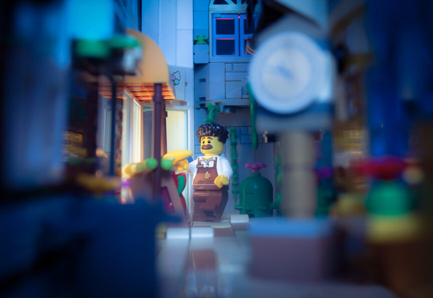
In the last picture, we see a night scene. The scene is lit with blue light, and the yellow light coming from the window shows that even though it’s night, there’s still work to be done by this salesman. For this one I used blue cellophane and sunlight for the main lighting and a led light for the light coming from the window.
Using props: Make yourself fake water
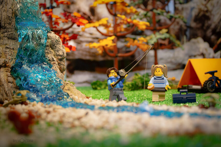
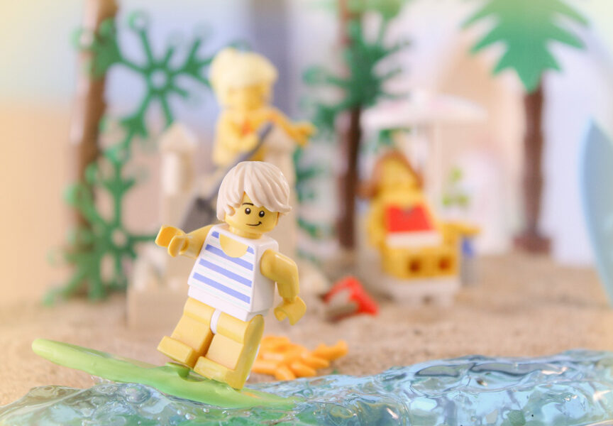
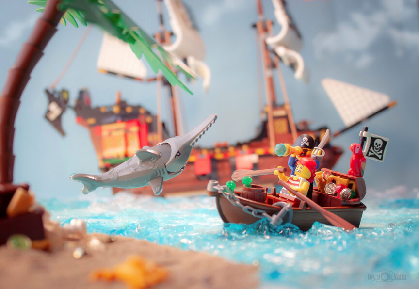
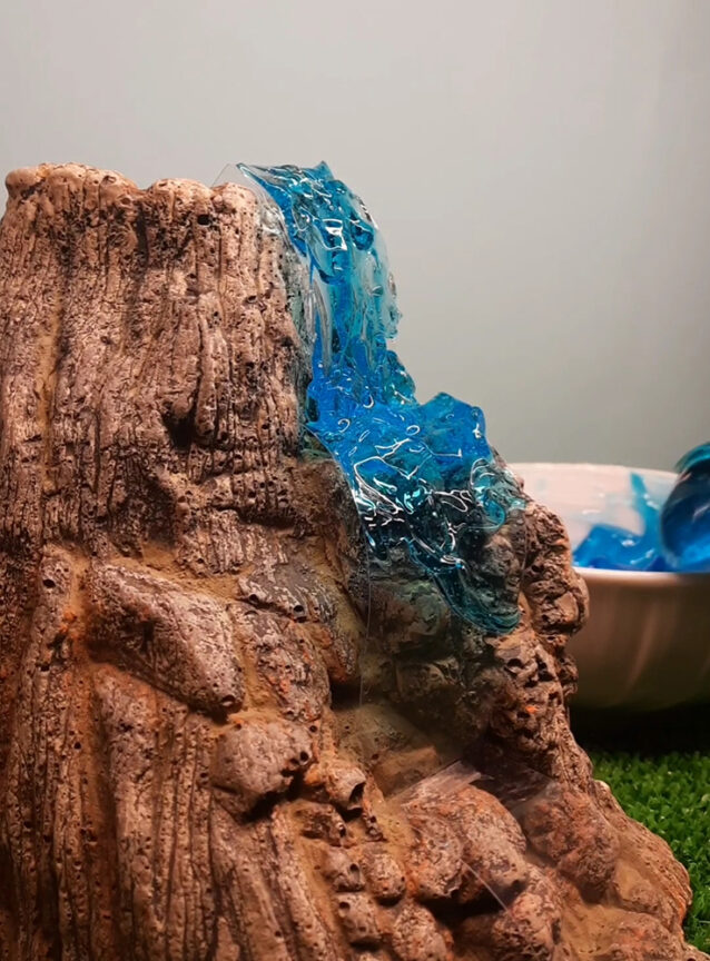
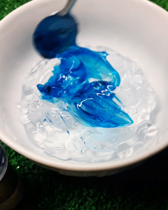
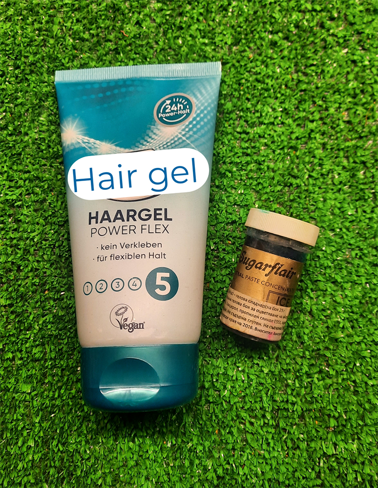
The idea of making water came to me 2 years ago when @sarouxbastoux held a tips challenge in Discord. I wanted to use water, but I needed it to be still and in one place. The easiest way is to use hair gel. You can modify its shape and color, splash it around if you want, and it will stay where you want it. Well, almost. If you put too much in a vertical position, it can slip away, but you can always reshape it.
How it’s made: I use thick hair gel and color it with blue food coloring, but you can use whatever kind you like, even use it clear. Then, place it where you need your water to be, shape it in the needed form or direction. You can also add a little bit of shaving foam if you need white places to be more realistic. The good thing is that it’s easy to wash it of your minifigures or parts. And voila! You have yourself water!
You can see a short clip here.
Movement
My last chapter is about movement. The best way to make your picture look like you freeze time is to make it look like there’s movement in it. There are a few ways to recreate movement. You can use posing methods, props like wires, Uhu patafix and ropes. Normal treads or LEGO ropes, too.


In the first example, I showed we can show movement by posing our objects, in this case the Nutcracker and ballerina. She is in a high jump and holding our hero’s hand, which is the only thing that’s supporting her. In the second example I used wire and Uhu patafix. You put everything where you want it, take the shot and then use an editing program to remove the wires and make magic happen. In the third example, I used LEGO rope. I place it behind the cart, so that it’s not visible from the viewer’s eye. And you have yourself great live feeling!
Hope you had fun reading this article and you find these tips useful 🙂

One Comment
Comments are closed.